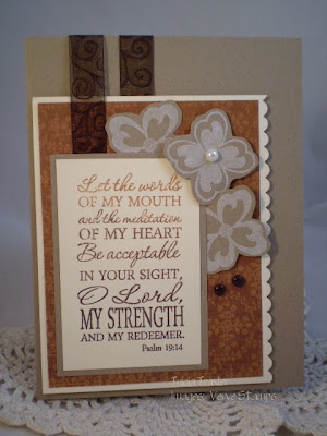
The Verve Project Parade this month has been wonderful & inspiring. Each of the design team, in turn, has shared the design process behind one of their cards. Including all the little details that make it *pop* in their opinion. As there is a $25 gift certificate to Verve up for grabs for a random participant, I decided I'd share the behind the scenes thought process for this card...
I have started to rely heavily on sketches to get me started. In fact, I have a sheet in my planner that is full of sketch challenges and color challenges and I'll often combine them if I can. For this card, I knew I wanted to use the Viva La Verve sketch #5 with a twist of texture. With the size of the rectangular panel, I decided to use the set Meditations, because I love it and haven't used it enough. I wanted to give the perception of a circle behind the image panel, so I stamped two of the flowers in the set a few times in PTI Fresh Snow ink on Kraft cardstock and cut them out. For awhile all the pieces just lay on my cardstock base, until I can see what "works". I wanted some variation in color, but I also wanted to keep it predominately brown, so I inked up my sentiment stamp with caramel ink, then cocoa, then chocolate chip. With the varigated sentiment, the lighter background paper, and the darker ribbon, there is plenty of variation to make it interesting, but it still looks "monochromatic", so it is soothing to the eye. To add texture to my card I popped up the main panel which put one layer of ribbon higher than the other. I also popped up some of the flowers.
As for embellishments, I'm a "less is more" kind of gal. I love ribbon and scallops and brads, and you'll find them on almost all of my cards. Buttons and flowers and pearls are harder for me to use, as is paper piercing, but they'll show up occasionally as well - in fact I used a pearl as a flower center on this card! Stitching on my cards is quickly becoming a new favorite.
My favorite design tip is actually one a friend of mine gave me when I was frustrated with my piano playing. I'll never forget what she told me. "As you keep practising and listening to others, you'll pick up ideas and techniques that fit you and you'll develop your own style. It doesn't have to be like anyone else's." There are so many wonderful designers out there that it can be very intimidating, but just pick one thing you like from their design - how they place brads, tie their bows, pierce their layers, color, etc. - and try to incorporate it into your next card. As you keep doing this, you'll be surprised at how much you'll improve and how you will start to develop a distinctive style of your own. It may not be the PaperCraft style - that's ok. This is just supposed to be fun!! So off you go now. Enjoy creating!!
Many blessings,
Tricia

10 comments:
Gorgeous card! I love those flowers on the side. And what wonderful advice!
It seems a lot of us rely on sketches! It is a really great way to start and find inspiration! You card is beautiful. Great job!
Tricia, this card is stunning! I love how you graduated the colors on the verse. I'm definitely stealing that idea in the future, just so you know. :)
So pretty. The colors are so nice and mellow, but contrast well enough for great design.
This is beautiful! I love the monochromatic color choices! That ribbon is yummy, too!
This is a beauty, love the verse and your pretty details...neat way to do the ribbon!
Tricia, your card is so beautiful. Thanks for sharing your Divine Details.
BEEEutiful! I just adore this card, and love reading about your process:) Thanks for playing with us!
Absolutely stunning!
What a great post and beautiful card. Love your piano teacher's advice... so true! Thanks for playing along in our parade!
Post a Comment